Redesigning the Logo for insurance firm, Quotall.

Quotall provide a leading edge, online trading platform and consultancy service that allow its customers to quote, buy and manage insurance products.
After 2 years in business, the company wanted to refresh its identity. Ian Paget was hired to redesign the logo, whilst retaining equity already built up with the existing logo.
The founders knew that technology will increasingly influence the market and insurance distribution, so they set out to provide a powerful, leading edge, online trading platform that enables customers to quote, buy and manage insurance products and services.
On top of this, Quotall also provide an insurance consultancy service including a marketing agency that helps customers develop, launch and optimise their insurance propositions.

Evaluating the existing Quotall logo
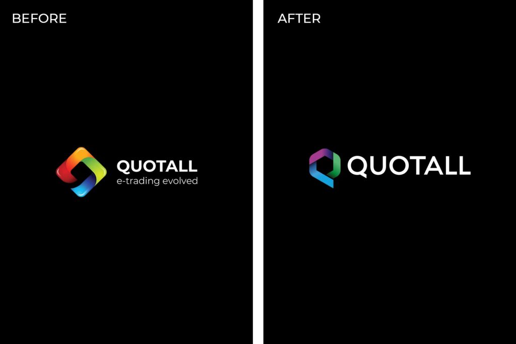
Before working on a redesign, Ian evaluated the current logo design to address the features that required attention, and those which could be retained to allow the new logo to be an evolution of its predecessor.
The first area to address was the colour scheme. The 4 colours used; red, yellow, green and blue was already owned by a world renowned brand – Google.
To avoid looking like the Google logo, the insurance company needed a new colour palette that they could own within their market sector. This had to be carefully selected so that the company would remain familiar to the existing customer base.
The logo also made use of a glossy highlight effect was a trend that was popular during the “Web 2.0” era that once ruled the web. When a logo makes use of trends like this, the design is often left looking dated and unprofessional once the wave has passed.


